Defining a brand persona to create visual identity that reflects a memorable brand and website experience.
![]()
Introduction
Keet is done with the healthcare status quo. Keet believes that the key to treatment success is partnership. While delivering innovative health technology solutions that put clinical-grade care in the palm of patients’ hands—this treatment software helps deliver recovery faster to solve one of the biggest factors for wellness and productivity for working adults—musculoskeletal health.
My Role
Brand Strategy / Branding / Website Design / Website Development / Production Design The team
Solo designer/developer, Creative Director, Account Manager, Delivery LeadTIMELINE
November 2020 - February 2021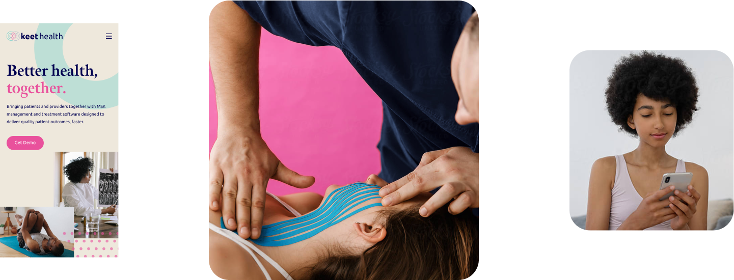
Why refresh the brand?
This startup is reaching for its next level of maturity. It requires a foundation to support its growth and to gain market penetration; to attract and retain clients, prospects, and investors, the story needed to come alive.
Challenges
- One brand and website to serve three distinct user groups—patient, providers and insurers
- Uplevel the brand, without requiring a major overhaul of its branded platform or app
- Work within the confines of a WP Bakery theme
- Deliver in under four months
Approach
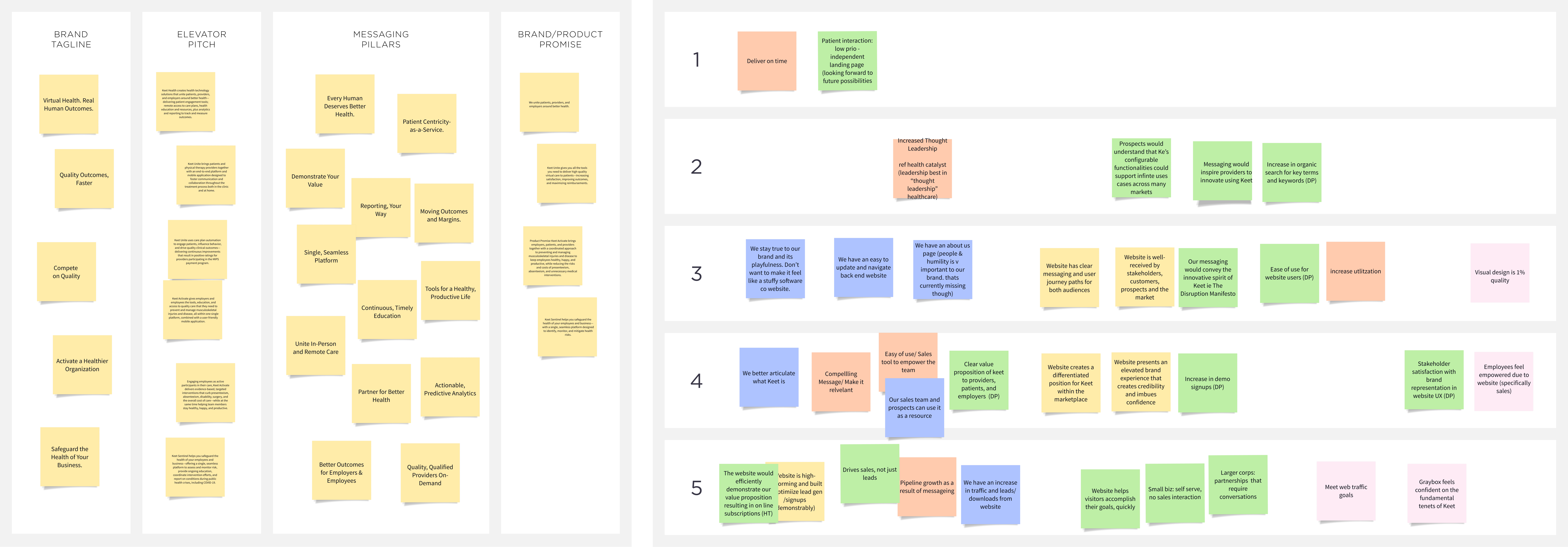
1. Brand Audit — Past, present, and future2. Positioning Workshop — Distill the product & re-align messaging
3. Personality — Communicating the brand character
4. Visual Identity — Look & feel across all touchpoints
5. UX Strategy — User-centric approach to content delivery
6. Website Design & Build — UI design applied to WP Bakery builder
1. Brand Audit

1.1 Company background
Keet Health has been committed to helping providers, employers, and health systems facilitate and deliver more connected, personalized care through our patient engagement platform.
Keet, Inc. is a wholly-owned subsidiary company of Clinicient, Inc.
2. Positioning Workshop
Collaborative workshop
As I planned and facilitated positioning workshop and design thinking exercises, participants helped to distill a complex product down to its core functionality and benefits to each user group, and broke down the essential narrative points for its various audiences.
3. Personality
Using personality sliders we plot where we are now (lighter mark), and the personality that feels most natural for Keet’s new positioning.

Personality sliders
Finally, using a brand archetype wheel, I map out the key themes and messages I've observed during the brand audit and heard while workshopping with stakeholders.
In parallel to the personality sliders above, we decided that the brand archetype that felt most natural to Keet is the Hero Archetype.
In parallel to the personality sliders above, we decided that the brand archetype that felt most natural to Keet is the Hero Archetype.

Archetype Mapping
The Hero felt most natural to Keet’s brand vision because it shares most of its attributes with the brand. ‘they stand up for what’s right’, ‘ inspire and make other feel empowered to succeed and achieve’, ‘To make a positive mark on the world.’ Combined with an encouraging and achievement-oriented approach to add envoke empowerment in the experience, the Hero Archetype is the perfect fit for Keet’s brand.

hero brand archetype
4. Visual Identity
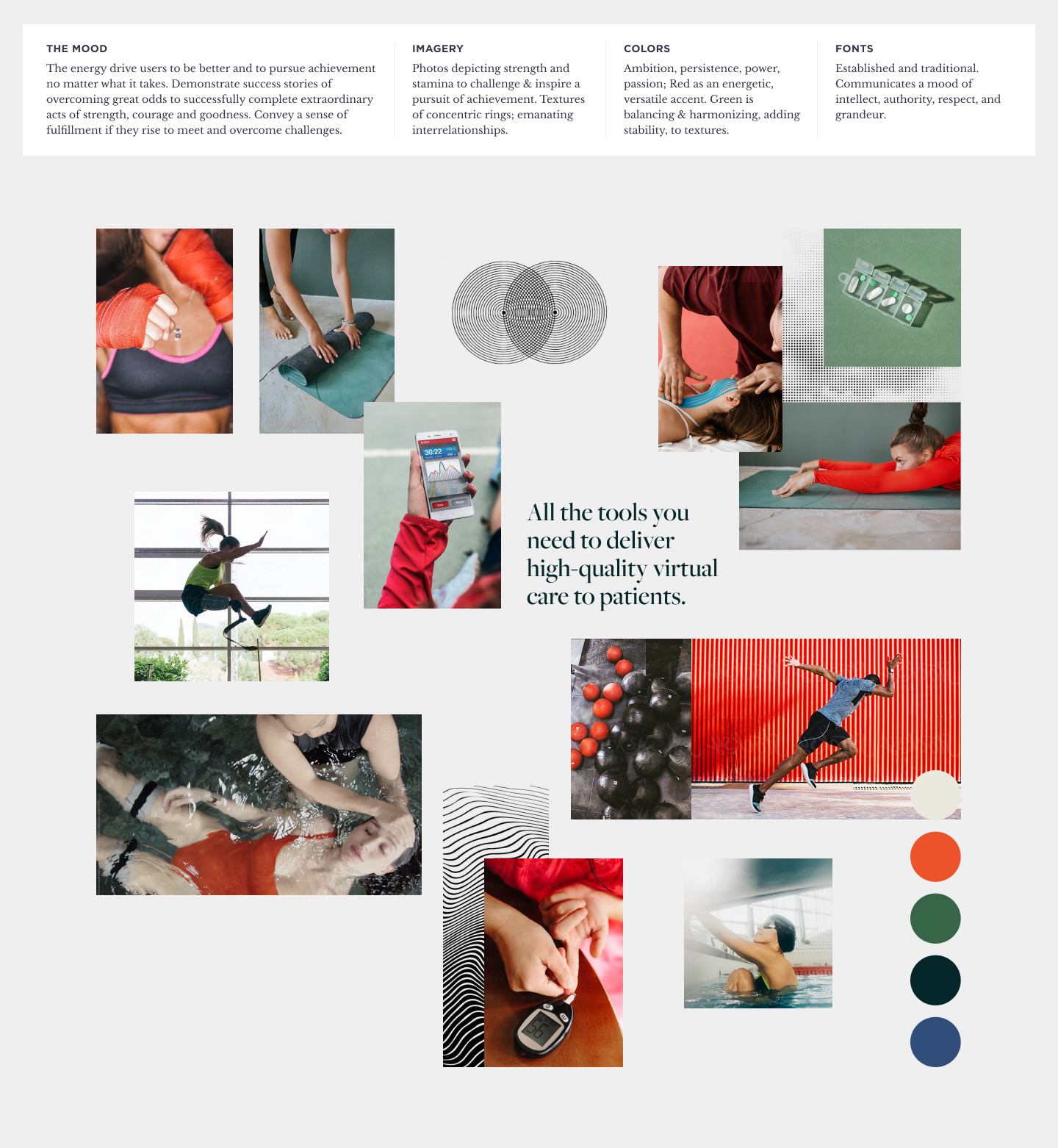
The exploration of Keet’s brand personality, provides a framework for understanding and portraying the brand's unique character in the healthcare space. As develop our ‘Why’ and start to get a feel for the mood of our brand, we can identify a whitespace in line with Keet's mission and values to build an identity.
Visual Identity Exploration
Everything in our visual language would link back to the hero archetype that inspired us. We played around with bold san serif typefaces, graphic elements, overlapping images and layouts that broke the grid. We drew out a collection of sketches, which helped us explore the possibilities of adding hand drawn details and textures.

Final visual identity
Typeface — Meno Banner and Ubunto — bold, simple and communicative and evokes a sense of intellect and formality. Perception is trustworthy and dependable.Colour — Current palette, refreshed. Warm and comforting, affectionate and intimate, thoughtful and caring. Soft, relaxed tones are soothing.
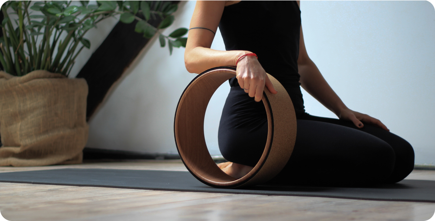
Imagery — Familiar objects, patient engagement, Keet in use, results of “better outcomes.”
Illustrations use fluid, wispy strokes to portray motion.
Graphic elements — Drawn iconography added a nod to the tactile nature of illustration.
Layout — Deliberately breaks the grid with overlapping text and images. Seemingly chaotic but with intention. Rebellious.
5. UX Strategy
Information architecture
At this stage we mapped out the site map which revealed a complex B2B service. We decided to focus on the Provider’s journey through the platform since we only had time to develop one flow within the time frame. The Provider’s perspective would allow us to develop the Resources content taxonomy and the Qualitry Programs and Platform page (two key areas the client wanted to develop).
Sitemap
Content strategy
content mapping
This also supports our theme selection for our Wordpress bakery approach, as it was important to deliver a CMS that made updating content on the backend easy for the Keet team.
Wireframes
At this stage the I developed a range of wireframes that incorporated all of the user needs through key features, specifying the layout and interactions:
- Interactive “How it Works” flip book
- Industry competitive overview of capabilites/features
- Exercise demo slider for patients
- Animated metrics and data points
- Platform animated interactive scroll
6. Website Design & Build

Telling the story
Together, we broke down clear user journeys for each audience to deliver rich, concise storytelling by articulating their voice, explain what they do, and update content site-wide. Once the site’s design and strategy were defined, we directed photography, animation, video, interactive graphics, and an identity that evolved Keet's existing brand touchpoint to remain recognizable to its existing customers; bringing thier mission to life. This content brought depth to the stories of patients and providers using the Keet platform, showing real people behind the product.Telling the story
With a flexible page builder tool and applied component system, Keet can now build and preview pages quickly to test content, messaging, and user interaction.

Keet is redefining the healthcare experience, with lofty goals for expansion and market share. Working in close collaboration, we provided them with a strategic vision for both the marketing site and the brand. They now have a clear product positioning, a personalized experience for all users, and are armed with tools to grow the site and the product into the future.
